The Power of Words

Words – so small yet so powerful. Red Bull is facing serious consequences for their choice of words in advertising. The famous slogan, “Red Bull gives you wings,” is under scrutiny for the implied benefits that consumers receive from drinking their products. Buyers were misled by the slogan, arguing that they believed they would see improvements in performance, concentration, and reaction speed after drinking the product. The slogan and advertised benefits have been labeled as deceptive and fraudulent, which led to the $13 million settlement that Red Bull will owe to American consumers.

Marketing is meant to inspire and elevate a brand, no pun intended. We have always given marketers a certain amount of leeway when it comes to interpreting their message. However, the interpretation of this marketing message is just too literal. Do consumers actually think that Red Bull will give them wings? If it did, trust me they would be making billions and not selling energy drink products. The answer is “of course not.” Emphasizing words like “wings” and “boost” implies some sort of physical effect or enhancement. But isn’t that the point of drinking anything caffeinated, whether it be coffee, soda, or an energy drink?

It’s clear that this case isn’t black and white. It falls somewhere in the gray zone where personal interpretations of advertising can vary. Perhaps some people believe that Red Bull is deceiving customers by failing to live up to an impossible promise but it also might be a ploy to get a quick dollar. However, I take it for what it is: a product that may give me a little more energy to get through my day.

We’re curious to see how this lawsuit will (or will not) affect their brand. After all, publicity is publicity, loyal consumers will probably just shake their head and take another swig, but will it set precedent for other such claims and how will it effect advertising and marketing claims overall?

What do you think about the lawsuit? Will you continue to buy Red Bull products? We’d love to hear from you. You can comment here, on Twitter, or Facebook!

Packaging Spotlight: Legit Organics

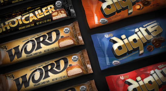
New products hit the market on a daily basis but every so often, a product comes along that warrants attention. Legit Organics, headquartered in Ashland, Oregon, recently released a line of organic candy products targeted toward a young, modern audience. Organic candy is an innovative development, but what we’re caught on is the unique branding, logo and package design. The traditional candy market has a very distinct look and style but Legit Organics stands apart from the rest- for better or for worse.

We asked a few graphic designers and consumers to give us their take on the new packaging. Their answers may surprise you (or make you laugh out loud):

  • “I love the logo, and even the gold and black presentation. The flow of the type reads ‘dreamy and far out man’. The color presentation says it’s a little more adult than smoking in your parent’s basement. I get premium and unafraid organic, something that I feel is lacking in the marketplace. Too many organic products focus only on the Birkenstock hippie market but everyone I know eats organic something, none of them wear ugly sandals or live in a commune.”
  • “The lettering is beautiful, interesting and very clear to read. All of the reflection and highlighting speaks to manmade, processed, glitz & drama- not natural. The background subjects are very urban and evoke excitement. It is reminiscent of motorcycle/sports car brand marks or even nightclubs and the product illustration evokes strong appetite appeal.”
  • “I don’t think it comes across as a candy product. It’s visually appealing but I don’t connect the fonts and images with the product and market it represents. Yes, it is innovative and original but if it weren’t for the picture of the candy I would never know it was a chocolate bar- and probably wouldn’t buy it.”
  • “The packages are very nicely designed. With that said, these really aren’t my cup of Cristal. The R&B slant on (read: pandering to) urban nightlife is a little played. I know R&B is the thing, but everyone from energy shots to electronic cigarettes are vying to call it their own, applying it to late night munchies seems a little too silly to be taken seriously. I sure hope they have some B-list celebrities endorse them.”
  • “I feel like the overall look is a complete disconnect from the organic roots of the product. Nothing about clubbing at 2 in the morning says healthy to me. The style feels throwback 80’s, which feels a little dated but then again I’m from the generation they are reliving here. They’ll probably sell like crazy.”

Regardless of personal opinion, Legit Organics is making a splash in the candy market that may ultimately change consumer perception of organic products. By creating an organic label that feels cool, rich, and bold, they are paving the way for other companies to experiment with organic labels in new and different ways. We’re excited and curious to see how the market receives their product!

Me first?

I was on a plane traveling and had an interesting observation. When you are on a plane, they always tell you to put your mask on first before helping others put theirs on. How come in life we tend to put others first except on an airplane? The notion of taking care of yourself first so you can be prepared, healthy and ready to help others is, or at least should be, words to live by everyday. I know that when I sleep better, exercise and give myself a little time to be, I can be a better parent, partner, and leader to my company and clients. That’s not to say that we should all be selfish and self-focused, but a little self care goes a long way.

Is short always memorable?

Have you ever noticed how you don’t think twice asking for a Pepsi, a Coke or sending a package Fedex, when the real names of the companies started out as Pepsi Cola, Coca Cola and Federal Express? We work with many clients to create new, innovative and proprietary brand names. Some of our clients want a brand that is just initials, and I always come back and ask them… Why? They reply – It is easier to say, memorable, and short.  But in all truth, it is ONLY easier to say, memorable and short because its roots were longer and resonated with the consumer with more meaning to begin with.

Since it is March Madness, let’s look at the equities and evolutions of university brands. University of Pittsburgh or PITT. University of Texas, otherwise mostly referred to as UT,  University of Missouri or MIZZOU. People would think you were seriously uncool if you were cheering in the stands screaming “Go University of Pittsburgh” verses “P-I-T-T Let’s Go PITT!”  Brands are living things, and the clients and customers they keep mold and shape them even if they don’t want them to.

Your customers will take you where they need and want you to go. Those are words I live by. But don’t disregard the power of creating brand equity based in meaning, strong positioning and power when you are starting off. Brands need to be explained, defined and reinforced. Only then can they be shortened and recognizable at the same time.