4 Ways to Protect Brand Equity During a Redesign
/
If you have a brand that’s been around for a few years, one of your biggest challenges from a design perspective is maintaining your current equity while making sure your brand is relevant enough for modern consumers. It’s a delicate balance!
If you’re not familiar with the term “brand equity,” let me give you an example.
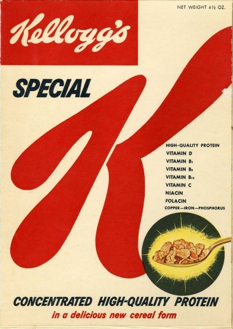
My favorite breakfast cereal is Special K. You’d recognize it; it’s the one with the giant red “K” on the package. My favorite flavor is Red Berries, which is easy to spot on the shelf because of its vibrant red color.
Imagine that Kellogg’s decided to refresh the brand. Maybe they want to follow the minimalist design trend, so they shrink the size of the K. Maybe their research indicated that Millennials favor the color blue. So they launch a new, blue package with a tiny “K.”
There’s no way I would be able to find that cereal on the shelf. I might not even recognize it as my favorite cereal when I saw it.
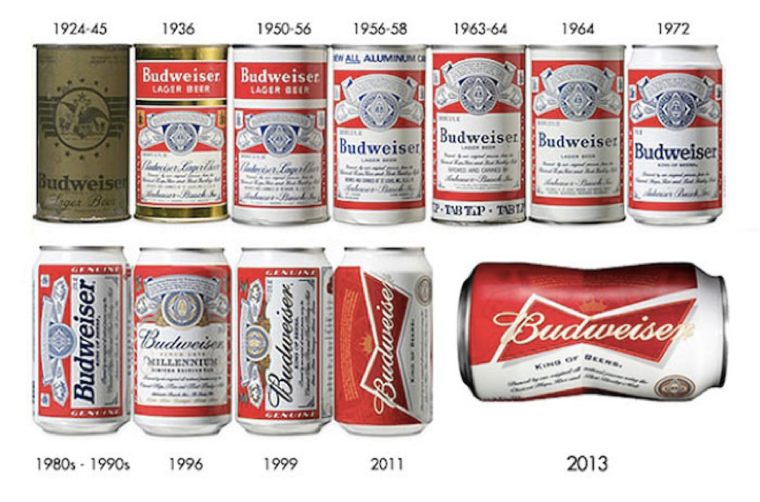
Instead, Kellogg’s has been very intentional in how they’ve evolved their brands over time. The giant “K” of Special K cereal is so integrated in how their customers recognize the product, it has hardly changed in decades even while the overall aesthetic has been modernized.

We like to call brands that have done this well “heritage brands.” They are able to maintain their brand equity over years and years by carefully updating their designs without losing the essence of their brand.
What lessons can we learn from these successful heritage brands?
1. Be Authentically You
Your brand has a unique DNA that is truly one-of-a-kind. You have your origin story, your values, and your mission. If you haven’t already, take the time to define your brand values clearly and concisely. What does your brand stand for?
If you have a clear sense of your brand identity, that can serve as a guiding light as you go through any change. If you have a brand that’s all about serenity, mindfulness and the environment, it probably doesn’t make sense for you to use intense colors and wacky fonts, even if that’s what your competitors are doing.
2. Maintain Your Individuality
It’s very tempting to chase design trends whenever the next new thing becomes popular. However, by saying “me too!” to those trends, you can become lost in the sea of sameness. While you want to look appropriate for your category and your target audience, don’t hesitate to be a little different from everyone else.
Look at Pepsi, for example. Their biggest competitor, Coca Cola, has indisputably owned the color red for almost a century. Pepsi, on the other hand, was the All-American brand that always had a red, white and blue can. Then, one day in the 90s, they suddenly owned the color blue.
By owning the color blue in their product category, Pepsi is now able to receive instant recognition on shelf. Being different from their main competitor was a brand imperative.

3. Strive for Timelessness
Your branding needs to stand the test of time so that your products will be recognizable for a long time to come. Especially in the CPG world, it’s very important that your brand doesn’t completely change overnight. In addition to your customers, you may deal with complications from your printers or your retailers if you change things too suddenly or too drastically.
This is another pitfall of chasing design trends. If you choose a very trendy design, you run the risk of looking very dated in a few years when the popular aesthetic shifts to something else. What will people think of “Millennial Pink” in a few years?
4. Build a Cohesive Brand
Above all else, you want your brand to look undeniably like itself. This seems obvious, but disjointed branding is all too common and can lead to a lot of consumer confusion.
Perhaps your brand has been around for 10 or 20 years and now you want to launch a new, organic line. You may be tempted to use an all-new color palette, with all-new claims on the package. You may even take the opportunity to update your logo, since you’re going through a new design phase anyway. The result will be a package that looks so different from what your customers are used to seeing that it will be like you started the company completely from zero.
Instead, take the time to ensure that all of your branding and marketing looks cohesive. This can include your logo, your packaging, your website, your social media posts, your print ads, and more.
Have you ever heard the fable of the boiling frog?
If you put a frog into boiling water, he will immediately jump out because he knows it’s too hot. But if you put that same frog into cool water and then slowly, over time, bring the water to a boil, he won’t realize the danger until it’s too late.
It may be a morbid analogy, but I often think of that frog when dealing with a long-term brand strategy. You want to make changes so carefully that your customers don’t even realize the difference, and yet you’re always perceived as a modern, relevant brand.
Good brand building takes planning and forethought.
This starts with building a strong, solid foundation for your brand.
Fill out the form below to download your copy of our Brand Experience Worksheet. This four-page, easy-to-follow worksheet includes questions that will help you clearly articulate the vision for your brand, consider how you want customers to perceive your brand, and craft an experience around your ideal customer.