Packaging Spotlight: Legit Organics
/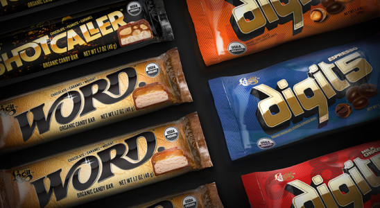
New products hit the market on a daily basis but every so often, a product comes along that warrants attention. Legit Organics, headquartered in Ashland, Oregon, recently released a line of organic candy products targeted toward a young, modern audience. Organic candy is an innovative development, but what we’re caught on is the unique branding, logo and package design. The traditional candy market has a very distinct look and style but Legit Organics stands apart from the rest- for better or for worse.
We asked a few graphic designers and consumers to give us their take on the new packaging. Their answers may surprise you (or make you laugh out loud):
- “I love the logo, and even the gold and black presentation. The flow of the type reads ‘dreamy and far out man’. The color presentation says it’s a little more adult than smoking in your parent’s basement. I get premium and unafraid organic, something that I feel is lacking in the marketplace. Too many organic products focus only on the Birkenstock hippie market but everyone I know eats organic something, none of them wear ugly sandals or live in a commune.”
- “The lettering is beautiful, interesting and very clear to read. All of the reflection and highlighting speaks to manmade, processed, glitz & drama- not natural. The background subjects are very urban and evoke excitement. It is reminiscent of motorcycle/sports car brand marks or even nightclubs and the product illustration evokes strong appetite appeal.”
- “I don’t think it comes across as a candy product. It’s visually appealing but I don’t connect the fonts and images with the product and market it represents. Yes, it is innovative and original but if it weren’t for the picture of the candy I would never know it was a chocolate bar- and probably wouldn’t buy it.”
- “The packages are very nicely designed. With that said, these really aren’t my cup of Cristal. The R&B slant on (read: pandering to) urban nightlife is a little played. I know R&B is the thing, but everyone from energy shots to electronic cigarettes are vying to call it their own, applying it to late night munchies seems a little too silly to be taken seriously. I sure hope they have some B-list celebrities endorse them.”
- “I feel like the overall look is a complete disconnect from the organic roots of the product. Nothing about clubbing at 2 in the morning says healthy to me. The style feels throwback 80’s, which feels a little dated but then again I’m from the generation they are reliving here. They’ll probably sell like crazy.”
Regardless of personal opinion, Legit Organics is making a splash in the candy market that may ultimately change consumer perception of organic products. By creating an organic label that feels cool, rich, and bold, they are paving the way for other companies to experiment with organic labels in new and different ways. We’re excited and curious to see how the market receives their product!